gpbl/react-day-picker(新しいタブで開きます)
主要言語: TypeScript
DayPicker is a customizable date picker component for React. Add date pickers, calendars, and date inputs to your web applications.
- star 数
- 6,863
- watcher 数
- 38
- fork 数
- 781
- issue 数
- 17
- 最終更新
- 2026/10/22
主要言語: TypeScript
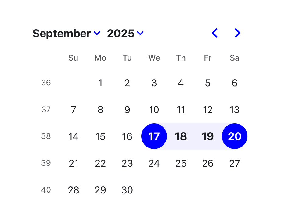
DayPicker is a customizable date picker component for React. Add date pickers, calendars, and date inputs to your web applications.
DayPicker is a React component for creating date pickers, calendars, and date inputs for web applications.
@daypicker/react is the preferred package name for DayPicker v10 and newer.
See daypicker.dev for guides, examples, and API reference, or read the v10 docs in the repository.
@daypicker/* add-on packages.DayPicker is written in TypeScript and compiled to CommonJS and ESM. It relies on date-fns for date manipulation and formatting.
Install the preferred DayPicker package name:
npm install @daypicker/react
import { useState } from "react"; import { DayPicker } from "@daypicker/react"; import "@daypicker/react/style.css"; function MyDatePicker() { const [selected, setSelected] = useState<Date>(); return ( <DayPicker mode="single" selected={selected} onSelect={setSelected} footer={ selected ? `Selected: ${selected.toLocaleDateString()}` : "Pick a day." } /> ); }
DayPicker is compatible with React 16.8 and later.
DayPicker is released under the MIT License.
Ask for help and share your experience with DayPicker:
Thank you to everyone supporting DayPicker - your sponsorship keeps this project maintained and evolving.